In this page I will demonstrate my development for digital package that I will create for my project with music video and artist website.
I will create a four sided digital package. The front image needs to be colourful, bright and outstanding in order to attract my audience. The back should be unique and colourful as well.
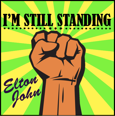
I used Photo Shop to create my first digital package. The fist represents “freedom”. I used this symbol to demonstrate the freedom as in the music video. However, after discussing to my classmates and teacher, I’ve decided not to use it in the future, as people may have a wrong idea.
Yellow and green were chosen to represent artist’s favourite colours.
My digital package plan:
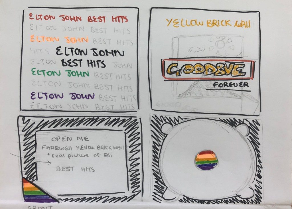
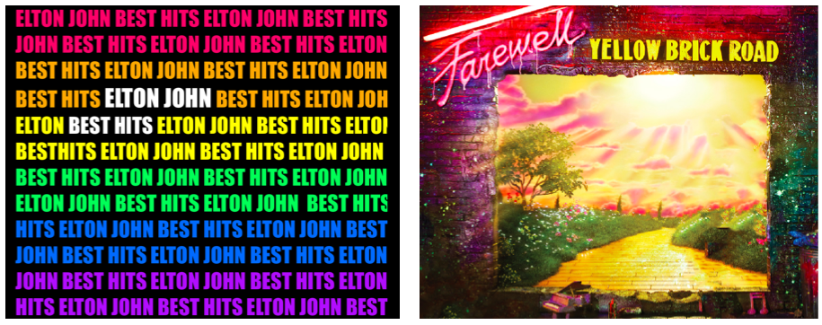
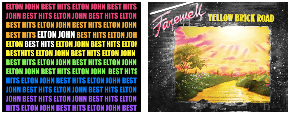
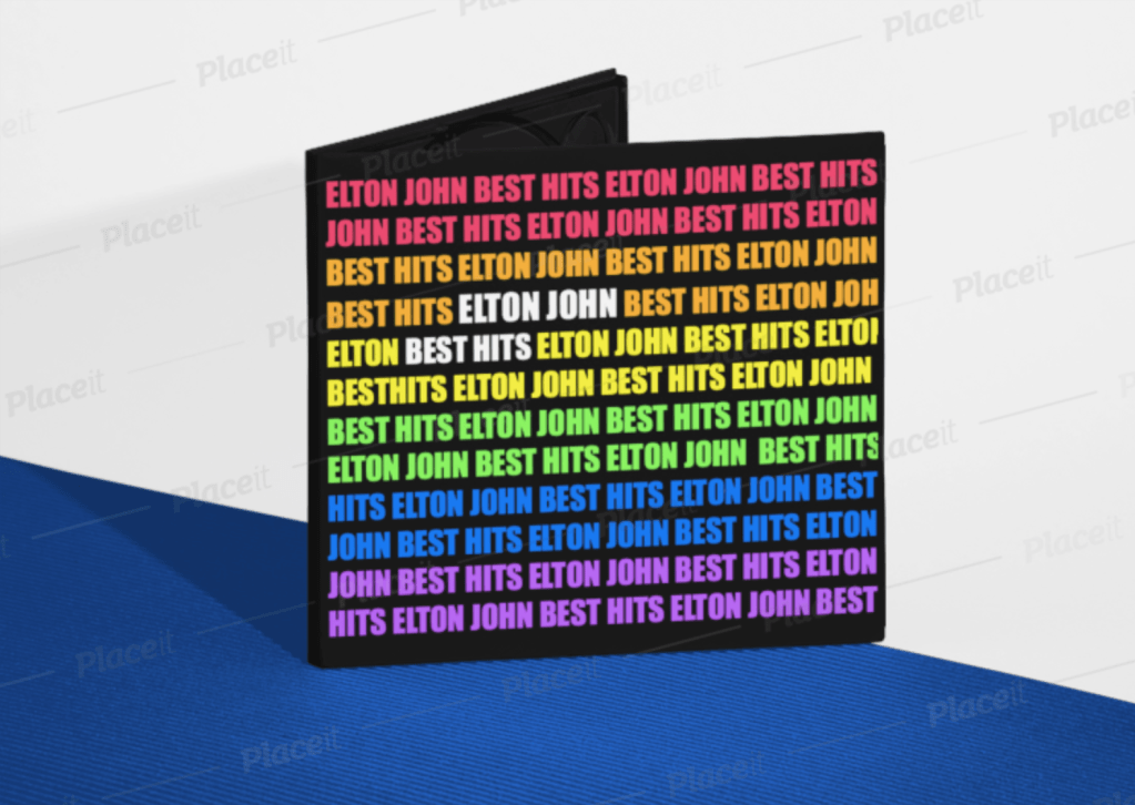
- First page / Front page
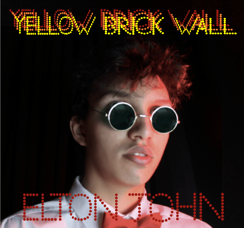
The Front Page will be simple, however very colourful and bright. I decided to have only text, repeating words “Elton John, Best Hits”, because this album contains only the best and most famous songs that he has created throughout his career. I want to have different colours (preferably from the pride flag, because today Elton John is very open about LGBTQ community). Furthermore, I want to make an accent on separate words in the middle, so my audience won’t be confused with the name of the album and who’s the artist.
In my opinion, this idea will be very successful as it will be attractive because of the uniqueness. A lot of albums have pictures of the artists in order to promote their image and remind audience who is the artist. However, Elton John is well – known singer for both new and old generation, therefore in my opinion his image is not necessary to use. The colours will definitely attract younger audience.
2. Back side page
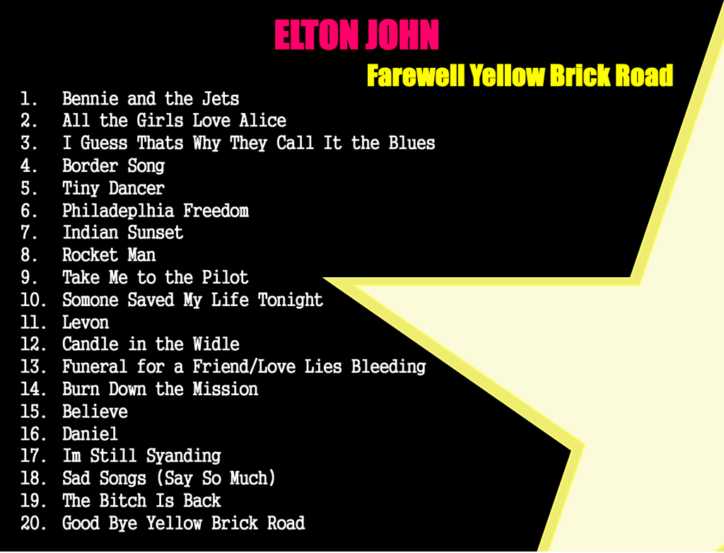
For the back page I decided to take edited (by me) picture of the “yellow brick wall”. The farewell brick wall was a big part of the artist’s life and I believe that it is important to use for his last “goodbye” album. It is also very well – known picture for a lot of audience, therefore it will be more recognisable among older audience.
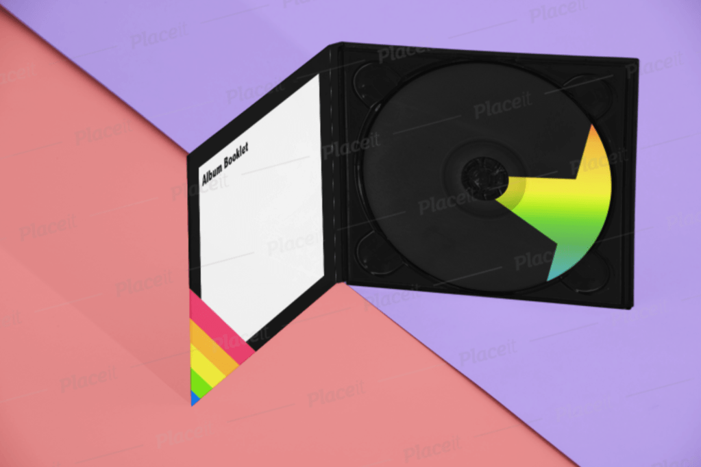
3. For the inside, I decided to make everything black as in the front page. Black represents darkness, but for me it represents the end of something. As it is the last album for Elton, I wanted to focus on the end of his career. However, by using bright / neon colours I still demonstrate the bright side of the singer and a big variety of his favourite colours.
Inside of the digital package, I will have an small 6 pages album where fans will be able to see the list of songs, credits for everything he has done, 2 pictures of the artists (the actor who participated in the music video), two drawn images (by me) and the front page of the album. I decided to create an album because I believe that it will be touching for the fans.

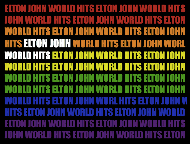
My second idea for the digital package is a pride flag with repetitive words “Elton John Best Hits”. I decided to use the pride flag to represent Elton’s sexuality as he is very open about it. To make an accent on the name of the song and the name of the artists – I decided to make the letters bigger and in white colour. This will make an accent and everyone will be able to see on the black background.
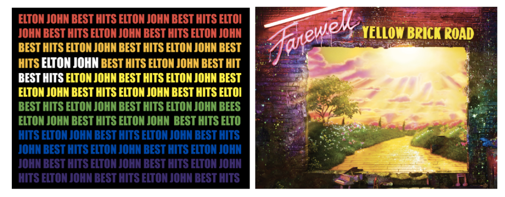
#1 – the first draft of the front and back pages of the digital package.
I like the idea that colours that are used for the first page can also be found on the second image on the back. However, colours on the first are not as bright as they can be. Therefore, I need to make sure that both of this pages will match the colours. I will spend more time in Photoshop in order to achieve the correct distribution of colours in two pictures.
I spent more time experimenting to achieve right colours on both pictures. After our class discussion, I realised that neon colours on both pages can be “too much” for target audience. Bright colours can be used if they are balanced with other colours, in my case it is too bright which can possibly scare audience. I decided to make the back page half black and white, but even then I don’t like the distribution of colours as it looks uneven and unbalanced.
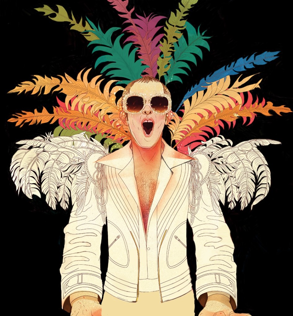
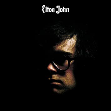
The next image was drawn by me and can be used as a picture for the album. I drew a portrait of Elton John on a black background and with feathers. I wanted to out line his favourite white suit and favourite big glasses with glitter. I want to use this drawing in the additional booklet album inside of the digipack. I think this should be used, as Elton John likes to publish and share drawings that are done by his fans. I have drew half of this photo by myself.
More Ideas
I used my previous work and tried to see how it would look on different templates. The digipack looks bright and has a positive theme. It represents positive and happy personality of the artist but doesn’t really promote his image or the album. It looks simple and not professional. I could possible use this concept for one of the upcoming albums, but not for the last album.
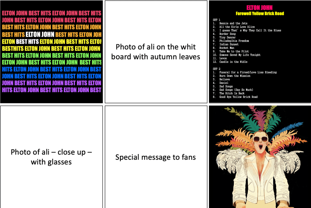
I have created a small template of my possible album and what can be inside. As I said before, I wanted to include credits, track list, drawings and pictures of the artist. It would be a small present for audience.
After researching on previous albums, I have decided to change my idea for the digipack.
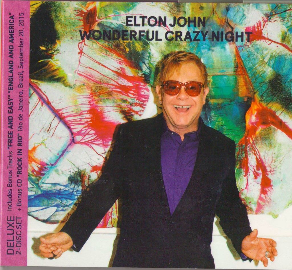
Mostly in all digipacks, Elton John used a middle/close up shot of his face/body. This is a great strategy to attract more audience. When audience see a close up shot of the artist’s face, this creates a “connection” between a consumer and the performer.
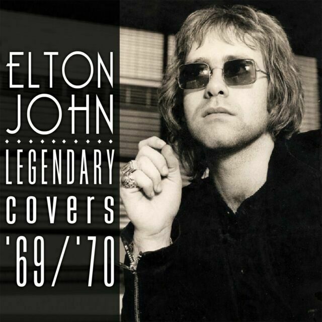
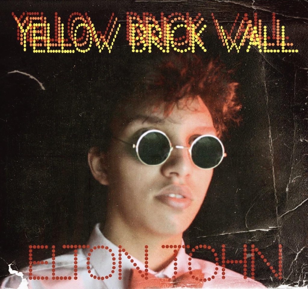
To experiment and see how it would work for my digipack, I organised a photoshoot with Ali.
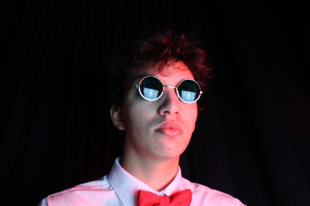
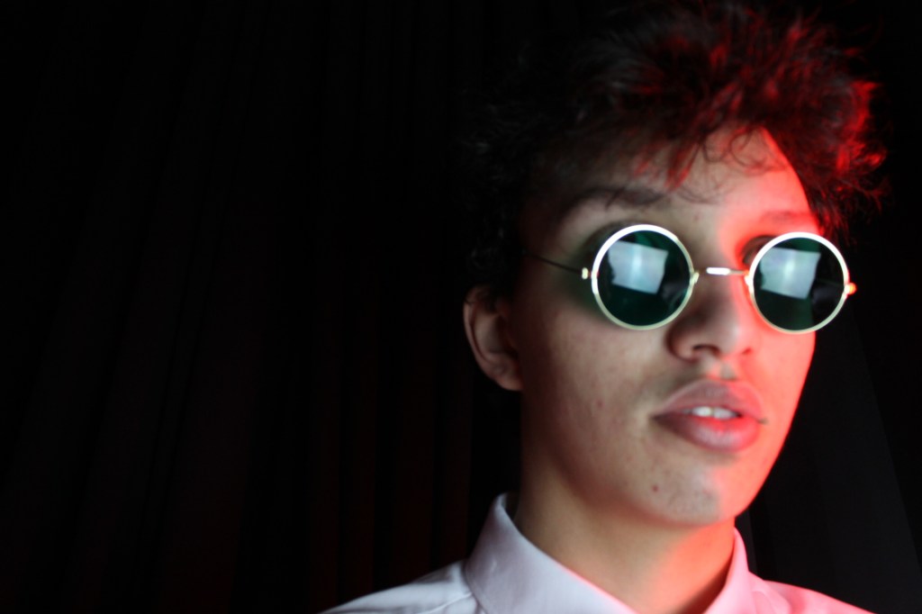
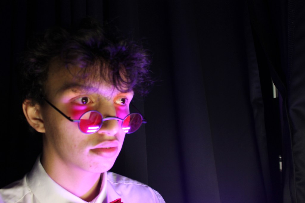
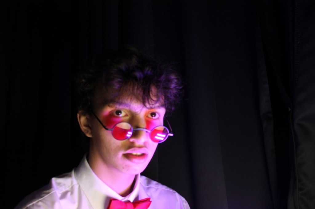
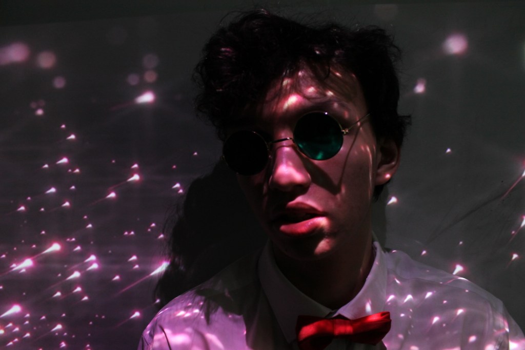
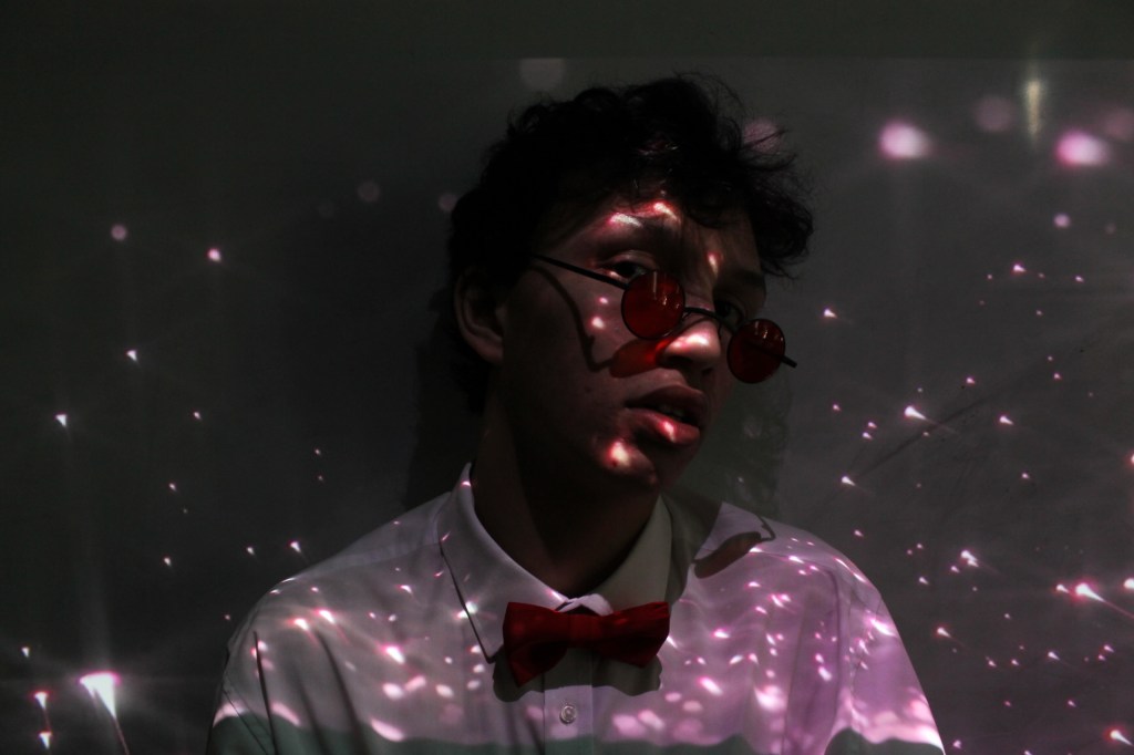
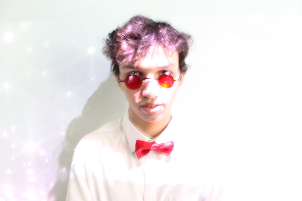
Here a few photos from the photoshoot. I specifically wanted to have a dark background, so I can focus on the face of the protagonist. I have also experimented with the projector to have more footage for my website. I used starts, to emphasise on the logo.
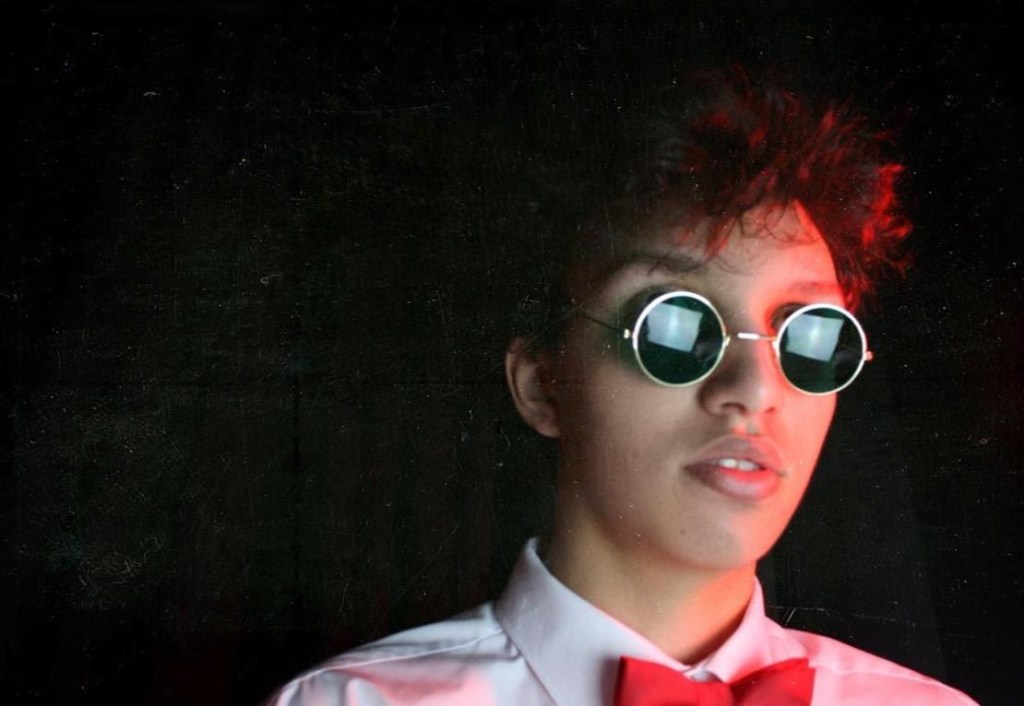
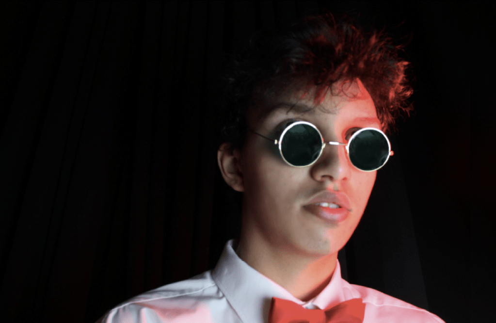
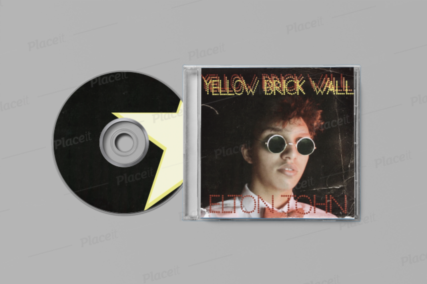
I started with Photoshop to edit my photo. I focused on the skin of the model and also the glasses. It is easy to see the lights reflecting on the glasses. Furthermore, I didn’t just want to have a black background. I wanted to have an effect that the alum is old. I have used different filters and effects in Photoshop .
After editing, I focused on the name of the album and the name of the artist. Numerous layers of one text looks like a 3D image. This will help to attract younger audience.

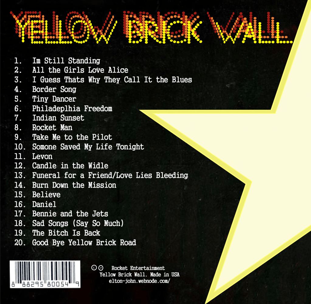
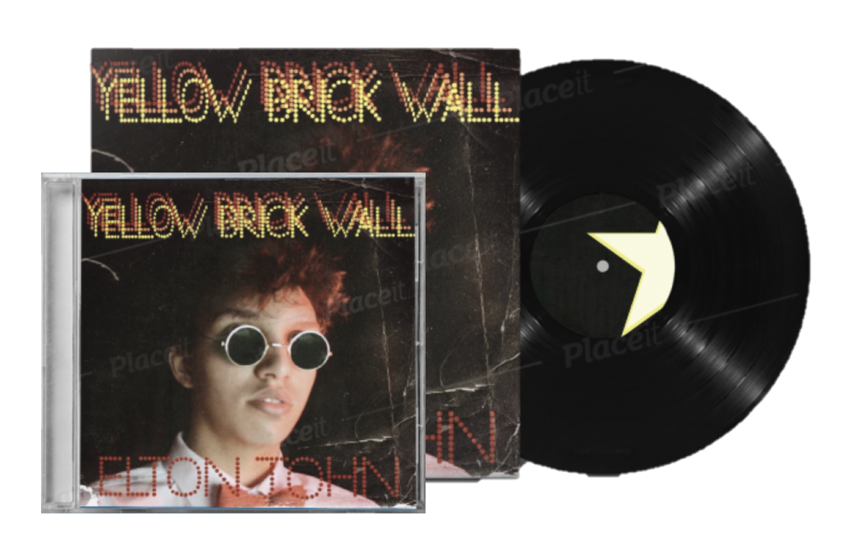
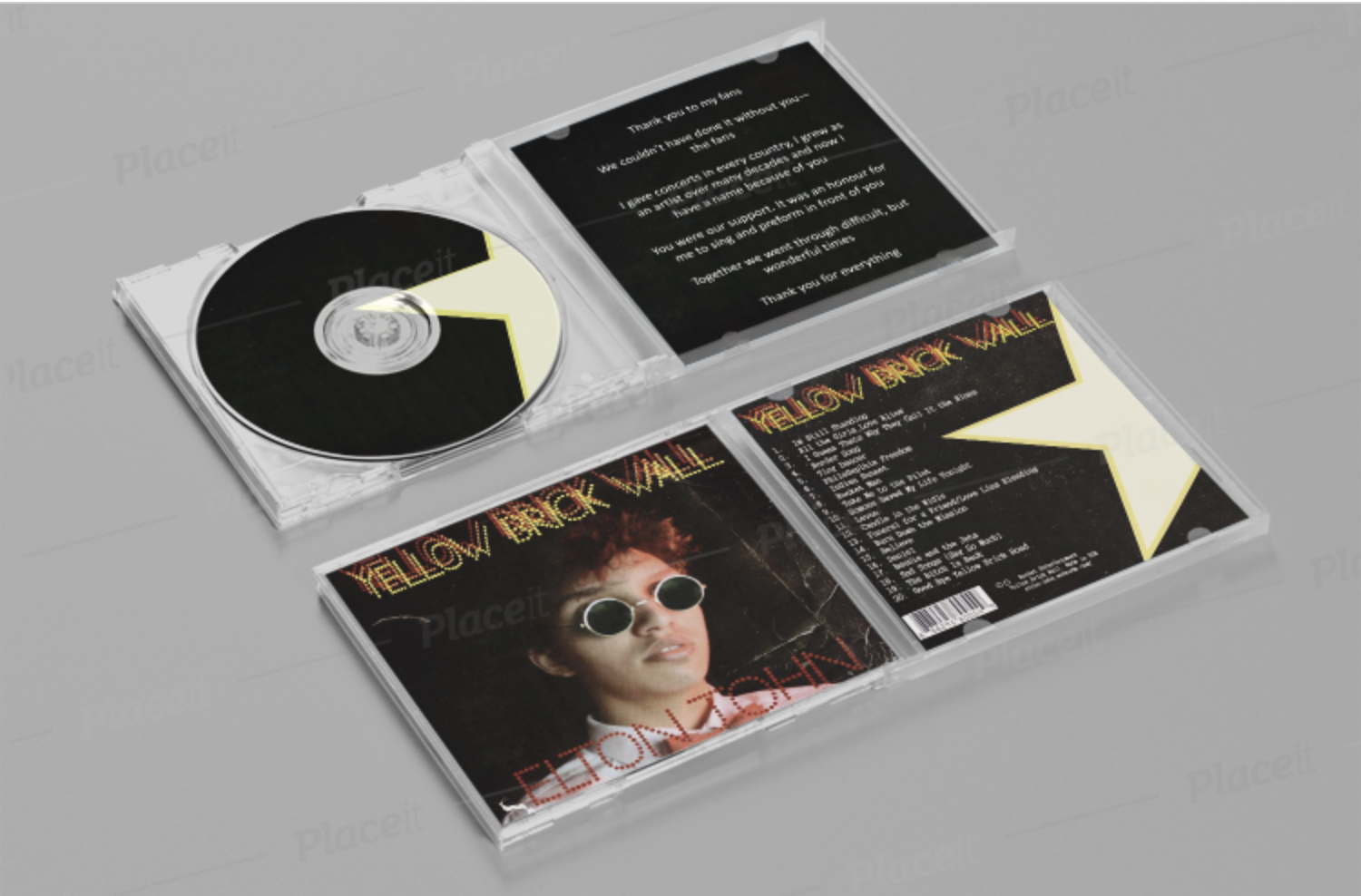
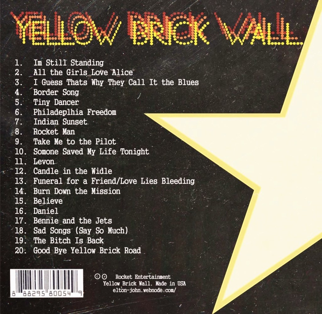
Then I focused on the back of the digipack. It is important to have a track list, barcode, the logo and the name of the album. In these three pictures, you can my development. I started with the logo, and from there I started focusing on other details. Track list was also created by me. I personally created the list and chose the order of each song. I have also added the link to the website, producing company and the name of the alum.
For the inside I chose to have a “special message to fans” instead of the album. In my opinion, as this is the last album, it is important to have a few words that will be dedicated to fans.
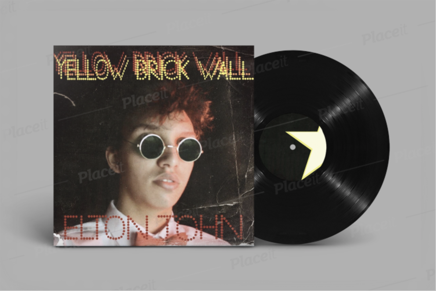
Final Version of the digipack
I wanted to have an effect of old as they song was written in 80’s. I believe that it will be more attracting to audience as it looks very old. It will look unusual among other digipacks, therefore will help to attract more audience.
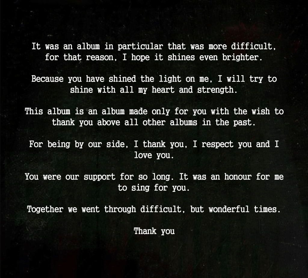
My “Special Message to the fans” will be inside with the CD. I was thinking about the idea of having a small text inside of the digipack for a long time because I wanted to make this digipack special from other albums. I tried to create a meaningful message that will touch “my” target audience.

On the CD , I decided to use my logo on the dark background. Here are some examples of how possibly my digipack would look.