Elton John
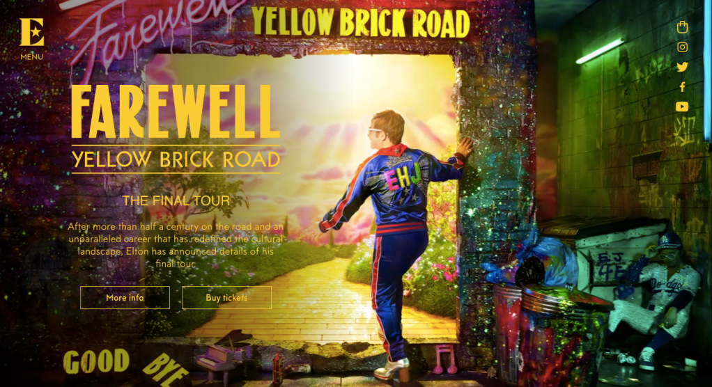
The first page of the “elton john website” looks very colourful and bright. This shows artist’s amazing and unique style through a big variety of photos of his iconic costumes. Furthermore, this image is dedicated to the well – known album “Goodbye Yellow Brick Road” that helped young Elton to enter the music industry and become successful.
To start with, we see two figures on the picture. Elton goes into the wall in his favourite tracksuit with his initials on the back. His glasses and his favourite shoes are easily recognisable on the bright background. Another person is sitting on the right side of the picture on the floor. All visitors of the website will be able to recognise another iconic and well known Elton’s costume of the baseball man.
The idea of the promotional image is to represent that Elton is going into something new and bright. He leaves all the dark behind him and confidently goes only straight. The sign “goodbye” is broken which can possibly mean that he is not leaving his audience yet.
Even though the first and the main image is very bright and colourful, everything else is very simple and in white colour. All other pages contain a lot of pictures/ images from the past. Because Elton John is not a full-time performer nowadays and he does not produce any new music, the website is dedicated to his career and past.
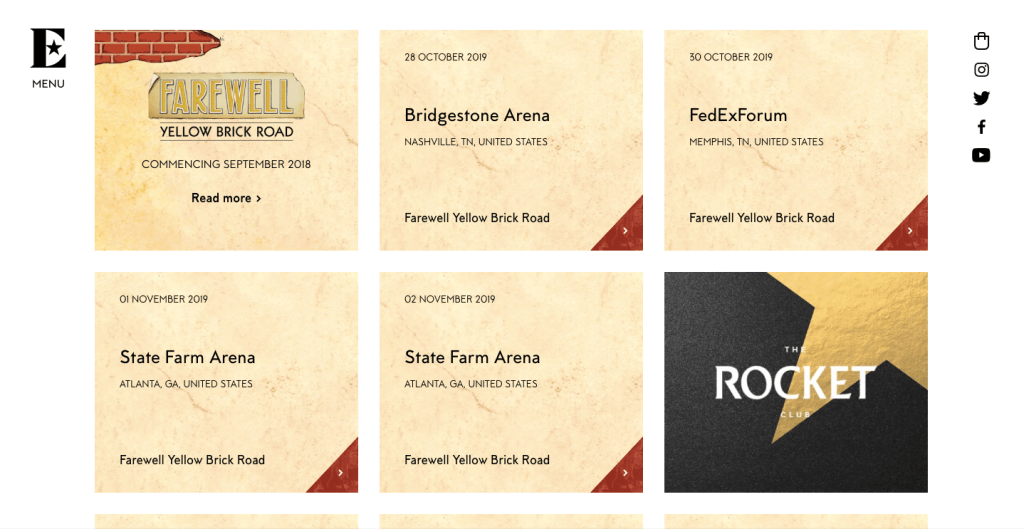
As I said before, the menu is very simple and easy to use. In the about section, users can find information about the artist’s past, more about his band, his works and songs. He has created and participated in my events dedicated to different charity events. Tickets for his last tour can be find in the “tour section” in the menu. Furthermore, he has his own shop, picture gallery and dischography with a full list of all his albums.
Elton John is a very interesting person with unique and bright personality. Making any conclusion based on his old costumes, we can say that he loves toxic colours and a lot of glitter. However, looking at the website, I can say exactly opposite. I believe they wanted to make it as simple as possible, in order to make it more convenient for the target audience.
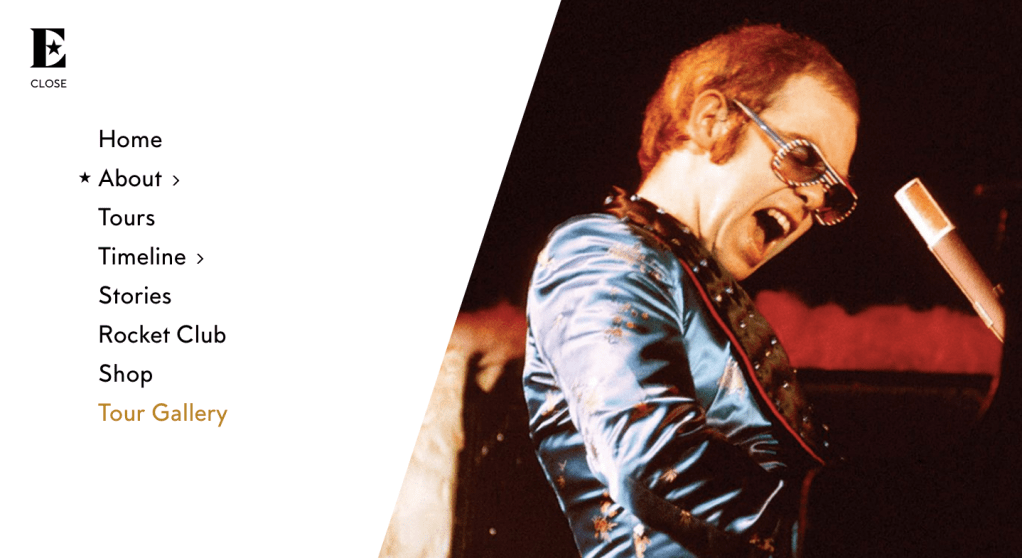
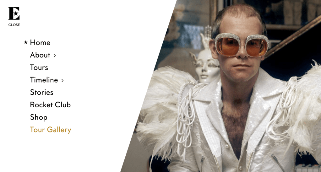
This is the main menu of the website. Because the artist is old and already has finished many tours, the website is more targeting on telling the audience about his life story, more than about upcoming tours and songs.
On the menu, we can see pages like “timeline”, “about” and “stories”. These pages were specifically created to show people his career journey. However, we can also see his tour dates and shop like all other artists.
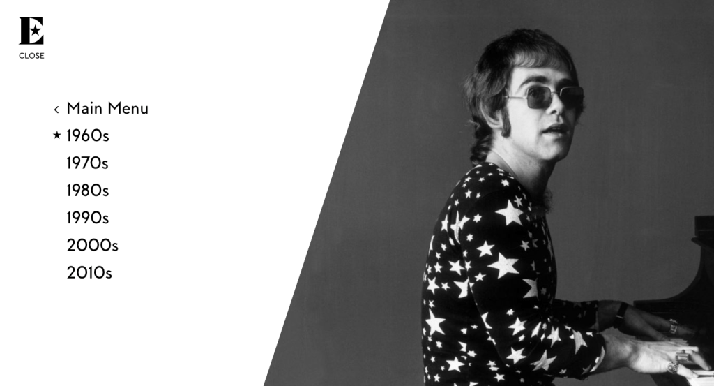
The timeline page is divided into different pages dedicated to each decade. Each of these pages describe in details what happened to the artist in a specific period of time. I can use a similar idea for my website, since I chose an artist how doesn’t perform as much as he used to. I can rather focus on describing his career and life story.
Bruno Mars
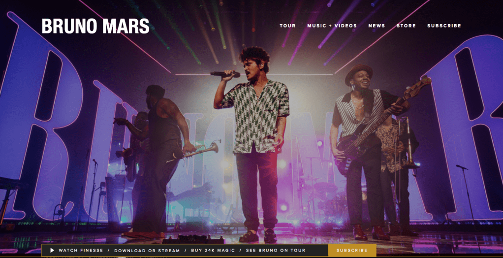
Bruno Mars is a very successful artist and has an interesting and modern website. From the very beginning, we can see that the website is colourful and bright. This means that the artist is targeting at the young audience from age 17 and above. At the centre we can a long shot of the artist performing on the stage, and his name on the left top corner with big bold capital letters.
*At the bottom, we can see a small box where fans can subscribe for his website. Thanks to similar boxes on each of artists’ websites, target audience will constantly get new notifications such as tour concerts, new stock of clothing line or new songs with music videos. This will help to promote the album and keep audience be entertained.
On the menu, we can only see five pages: “tour, music + video, news, store and subscribe”. On this website are not many pages like In Elton John’s website, however it contains everything that is needed for his target audience. For younger generation, there is no a necessity to have big websites as it might make them bored. Youth prefer websites which are easy to use and easy to find any information that thy need.
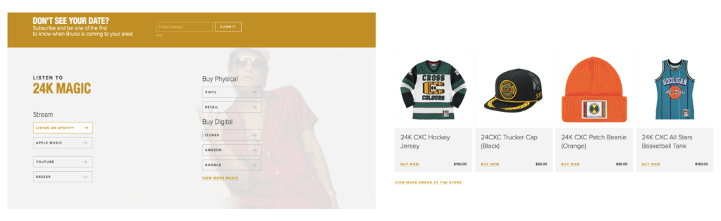
Furthermore, I realised that each website has a page dedicated to become a member of the website. Thanks to subscribing, visitors get all new information through notifications to each of the visitor’s mobile phones. It is very convenient as audience will not miss any information. Furthermore, becoming a member, visitors can easily buy any products such as: tickets or clothing direct form the website. The page looks very simple and easy to use for anyone who wants to buy a product.
Merchandise page looks very similar and is easy to use. All products look modern and have similar as Bruno Mars would have. This shows again that, the artist is focusing on young audience from age 17 and above.
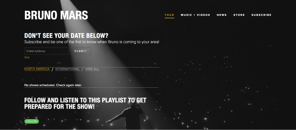
Instead of a list fo tour dates, everyone who is interested in finding the date, has to register or need to subscribe on the website. When a person subscribes, he or she will get notifications for the tour dates dates and more information about the future performances.
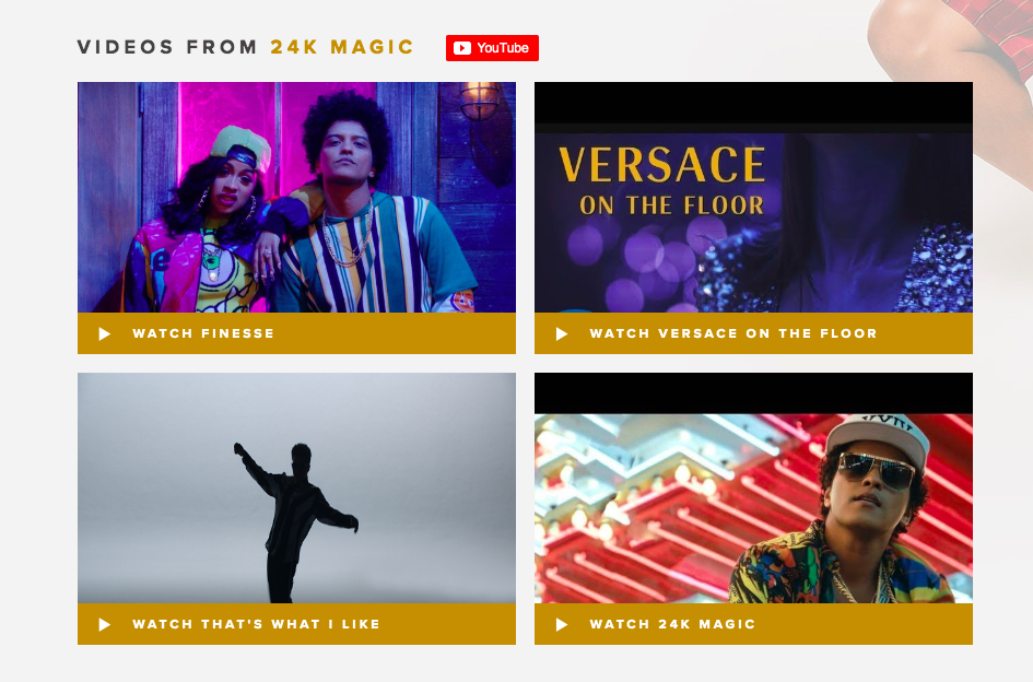
Bruno Mars has a page dedicated to his songs and music videos. It looks very similar to the Discography page where artists usually post all their previous albums and all information about them. Bruno Mars instead decided to post all his previous music videos. In my opinion, this was done to attract younger audience as they will be more interested to watch than read information about the albums.
Red Hot Chilli Pepper
https://redhotchilipeppers.com/
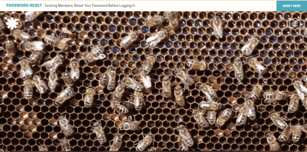
Red Hot Chilli Pepper has a very interesting and interacting website. When you visit the website, we can see an interacting and moving image with bees, which definitely attract younger audience. It will also attract more audience because of individuality and uniqueness, not many websites have a theme and moving images. It doesn’t represent the image of the band, however people will definitely be interested in keep scrolling down the menu page.
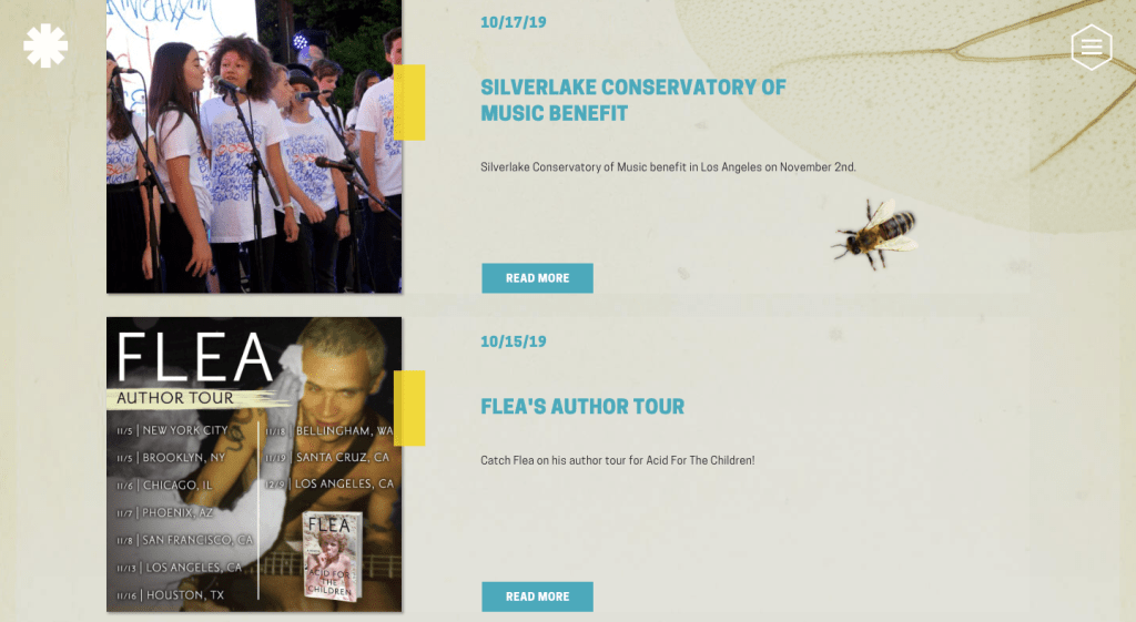
We can see all the news underneath the moving image with bees. Red Hot Chilli Pepper is a very popular band, however don’t perform as much as they did in the past. Therefore, the website s focusing more on the biography or on the events that already happened. Furthermore, there is a lot of information about the upcoming tours and other performances.
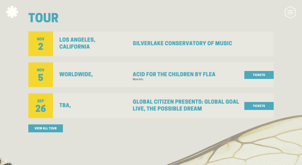
The tour page looks very simple which is done for more older audience. These colours are used throughout the entire website. Yellow and Blue are not the main colours of the rock genre, but on the other side the website looks very bright and colourful. The page has a lot of different details about bees, which brings us back to the menu page.
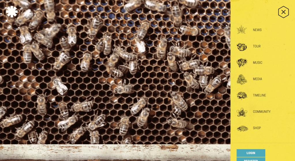
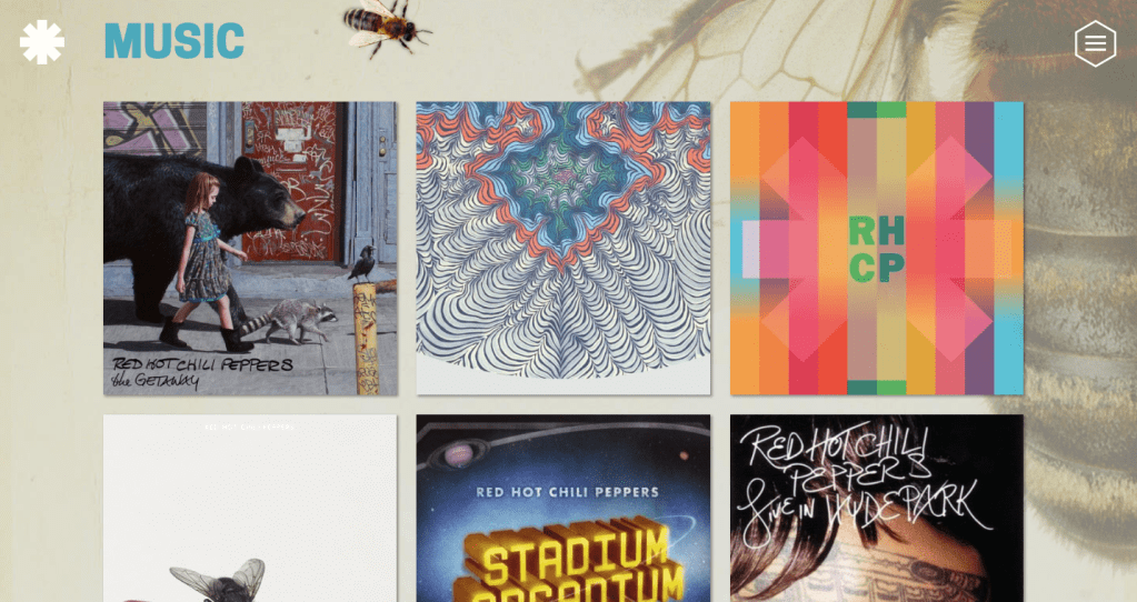
If we will open the menu, we can see that each page has a tiny logo, a picture of the flower next to it. This a great concept for a website to attract younger audience. Its individuality and uniques will stand among other artists’ websites and will attract more audience. Each page follows the same concept as the main page; we can see a background with a a picture of a bee. On the discography page, the band has posted all their albums with a lot of information about each of them.
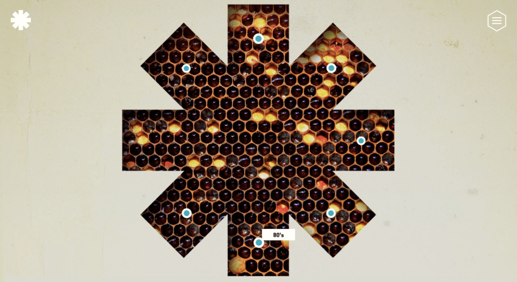
Instead of having one page dedicated to a specific decade for an old band, Red Hot Chilli Peppers decided to used their logo with same picture from the menu page to show the timeline. This is a unique concept to interact with target audience, to tell more about the band’s past and attract more visitors because of its individuality. We can see the main logo of the group with the honeycomb picture. Small blue circles demonstrate each of the decades or a specific time/year. This will definitely attract younger audience because they will be able to interact and “play” not only with the timeline page but also catching bees that are always flying on the screen.
In conclusion, I can say that all websites look very different from each other in terms of design and concepts, but are all the same with the name of the pages and information that is required on pages.
They all have in common:
- Main page with the name of the artist, pictures, videos, upcoming events and necessary information to attract more audience
- Page dedicated to the artist, in my case this is an artist biography with all information about his past and present
- discography – page dedicated to all previous albums and all information about creating, producing and making each of them
- merchandise – page dedicated to the artist’s clothing line and other products
- tour page – page with all the dates of concepts and buying tickets
- page dedicated to promote the new song and the music video
- links to Spotify or other programs where audience can listen to new songs
I will use this research to create a website which will be interesting for different ages. It will be unique, new and interactive for my target audience. It will also have a lot of information about my artist, tour dates, biography and it will share a concept with my other two products.
